Quick and Dirty Reporting for SharePoint 2013 Applications – Part 1
Good restaurants are hard to come by. The combination of tasty food, atmosphere, price, and service is a mix many owners never master. The same is true in using SharePoint as a platform to develop a department sized application. Microsoft Access, Excel and Lotus notes have traditionally played in this “no-code” space. However, SharePoint offers: tables, forms, a workflow engine, but lacks a little in the reporting area. A simple tool I have been using to resolve this shortcoming is Microsoft SQL Server 2012 Report Builder (you can download it for free here). Report Builder is a free graphics interface tool that visualizes data in table or chart formats. Report Builder can connect to numerous data sources, but what I like about it is that a SharePoint list is one of them. One of the core benefits of this tool is that you don’t need professional developer skills or tools to use this tool. With a quick little install, and a little report writing skills (MS Access / Excel) you can improve your SharePoint applications with stunning charts, graphs, and tables.
I have broken this down into two parts in this blog I will cover the building of the report. Next week I will go through displaying the report.
Part 1: Build the Report
- Create a default Task List app. (Setting > Add an App > Tasks)
- Download and install Report Builder. This can be done at https://www.microsoft.com/en-us/download/details.aspx?id=29072
- In the installation include a URL to your SharePoint site as the report server. The configuration does not matter for this scenario.
- Open Report builder. If you get a Connection error, ignore it and click OK

- There is a wizard which can be used but I will use the manual method to illustrate more.
- Click the option: Blank Report

- Right Click the folder: Data Sources

- Give the Dataset a meaningful name. I will name mine TasksDS
- Select the option: Use a connection embedded in my Report
- Select the connection type: Microsoft SharePoint List
- Paste the site address into the connection string box
- Click the button: Text Connection
- If you get an error: Check the URL

- Click the side button: Credentials
- Select the option: Use current Windows User
- Click the button: OK
- Note: the TaskDS is now listed.
- Right Click the folder: DataSets, Click the option: New Data Set
- Enter a meaningful name. The dataset is where you select what list from you site you will like to use as the core data for the report.
- I will enter the name: Tasks_Set
- Select the option: Use a dataset embedded in my report
- Select the data source: TaskDS
- Click the button: Query Designer
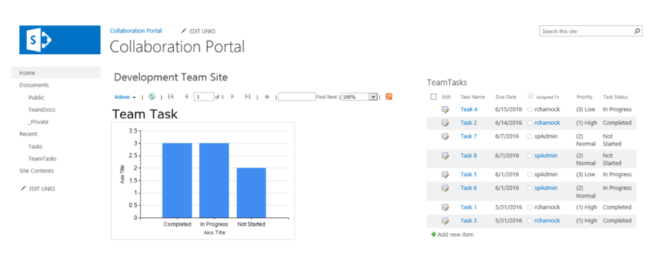
- Place a check in the list you want to use in your report. I will select the list: TeamTasks
- Click the button: Run Query to get a preview of the data. This is a good check to make sure you have selected the correct list.
- Click the button: OK
- Note: that closes the Query Designer
- Click the button: OK
- Note: The Dataset properties closes.

- Note: The Dataset properties closes.
- Now we can design the report.
- Click on the text “Click to add title” and add a title. I will add the title: Team Tasks
- Click on the Insert menu tab
- Click the ribbon button: Chart wizard
- Select the Listed Dataset
- Click the button: Next
- Select the chart type. I will select Column
- Click the button: Next
- On the next screen you design the layout of your chart. You drag the field you need to the different location. I will drag the following:
- Categories: Task_Status
- Values: Count(ID)
- Note: it will default to sum. Click the drop down arrow to change the function.
- Click the button: Next
- Select a style. I am going to choose: Generic
- Click the button: Finish
- Note: the wizard closes and your new chart is added.
- Next size the chart and report to be snug to each other and fitting your desires.
- Note: you can remove chart elements that you do not need by selected and pressing delete.
- Note in the image below, I removed the legend, Chart Title and execution time.
- Click the button: Run
- This will execute the report and show you what the final product will look like.
- To make changes click the button: Design.
- Note: that takes you back to the design surface where you can alter the report more.
- Once you have finished tweaking the report/chart to the way you like, click the Save button
- Save the report to your local machine. Remember to chose a meaningful name
- I will put mine in the Documents folder with the name: TeamTask_Status_Chart.rdl
- Close Report builder
Now your report is ready to go. In my next post I will dive into how you can visualize these reports in SharePoint.
Reference:
To learn more about how use Report build builder more Microsoft has a great help and walk through at: Report Builder in SQL Server 2016
To learn how to configure your SharePoint 2013 Farm to enable the use of Report Builder reports, complete steps 1-3 in the following article: Install The First Report Server in SharePoint Mode
For more information about gaining a competitive advantage with digital transformation, contact Red Level today.
Related Posts
At this year's Modern Workplace Summit business leaders discussed real-life ...
I have been involved in the technology industry, in the ...
Sometimes technology makes some scenarios worse. At our last Nintex ...


Did You Know?
Red Level has been chosen to receive the 2018 Michigan Works! Impact Award. The company was nominated for the honor by the Oakland County Michigan Works! Chapter in recognition of its success in forming strategic partnerships to upskill and expand the local workforce to meet industry needs better.