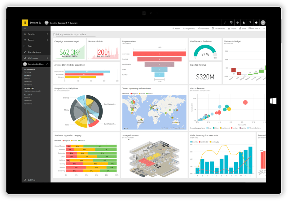
Power BI. It’s … well powerful. And there’s a ton of power hidden under the hood that you should know. These aren’t fun hacks. They are serious workflow improvements you can take advantage of right now. Don’t have Power BI? Get the latest version here.
If you’re not even proficient at BI, may we first recommend some videos?
- From Edureka: Power BI Full Course – Learn Power BI in 4 Hours
- From Naresh i Technologies: PowerBI Online Training Session 1
- From Zebra BI: 7 Worst Power BI Dashboard Mistakes & How to Avoid Them
- From Guys in a Cube: 5 things you didn’t know about Power BI Desktop
- From softlanding: All You Need to Know About Microsoft Power BI
- From Red Level Group: What’s The “Power” in Microsoft’s Power BI
Making a Well-Designed Report
You need a report, but the default report looks about as exciting as a screenshot of a pivot table. How about some hacks for making those reports into something you’ll be proud to present to your team.
- From BI Elite: 7 Tips & Tricks for Stunning Power BI Reports
- From Microsoft: Create reports and dashboards in Power BI – documentation
- From Microsoft Power BI: Best practices in visualization creation in Power BI Desktop
- From Predica: 5 Power BI Tips To Make Your Reports More Appealing And User-friendly
- From: Search Engine Land: Bridging Data and Action: How to create killer reports
- From chassMSFT: How to Design Visually Stunning Power BI Reports
Visualizing Bing Maps with Power BI
You can do some killer things with Bing Maps and Power BI. Here’s a collection of links to some of the things you can do:
- From Microsoft: Tips and tricks for Power BI map visualizations
- From SQLDusty: Power BI and the Bing Maps API
- From SQLShack: How to create geographic maps using Power BI
- From Onlizer: Connect Bing Maps + MS Power BI
- From YouTube: A whole list of Power BI + Maps videos
Building Killer Dashboards
Just like reports, having an impressive dashboard can save a meeting. Take a look at these tips and own your data. Or at least, make it exciting to look at.
- From Hitachi Solutions Braintrust: Power BI UX Design Tips
- From Microsoft: Optimize a dashboard for mobile phones – Power BI
- From the Power BI Team: Killer Visualizations in Power BI
- From BI Elite: Building a Power BI Dashboard/Report from Scratch (Beginner & Advanced)
- From DataFlair: Incredibly Easy Method to Create Power BI Dashboard
Adding Icons to Power BI
You can add icons to Power BI. This is extremely helpful for making nicer reports, tables, and let’s face it, getting people to look at and interact with your creation. Even better, many folks making additional icon sets for Power BI. We’ll get to those in a minute, but first, let’s make sure you have icons enabled.
How to enable icons in Power BI
- Go to the Conditional Formatting menu
- Scroll down to Icons and flip the toggle to ON
- Below Icons is “Advanced Controls” and you want to explore in here because it is in here that you can customize the icons your way.
Icon Sets for Power BI
- From PowerBI.Tips (Custom icons and theme)
- From FlatIcon (Over 500,000 icons!)
- From DataVeld (more tricks with icons)
Bonus:
Reddit has a thriving Power BI subreddit. It has over 36,000 members as of this writing and is frequently updated. LINK[https://www.reddit.com/r/PowerBI/].
If you or your team needs help learning Power BI, we offer some amazing QuickStart sessions for Power BI.
For more information about gaining a competitive advantage with digital transformation, contact Red Level today.
Related Posts
There's been tons of buzz the last few years' about ...


