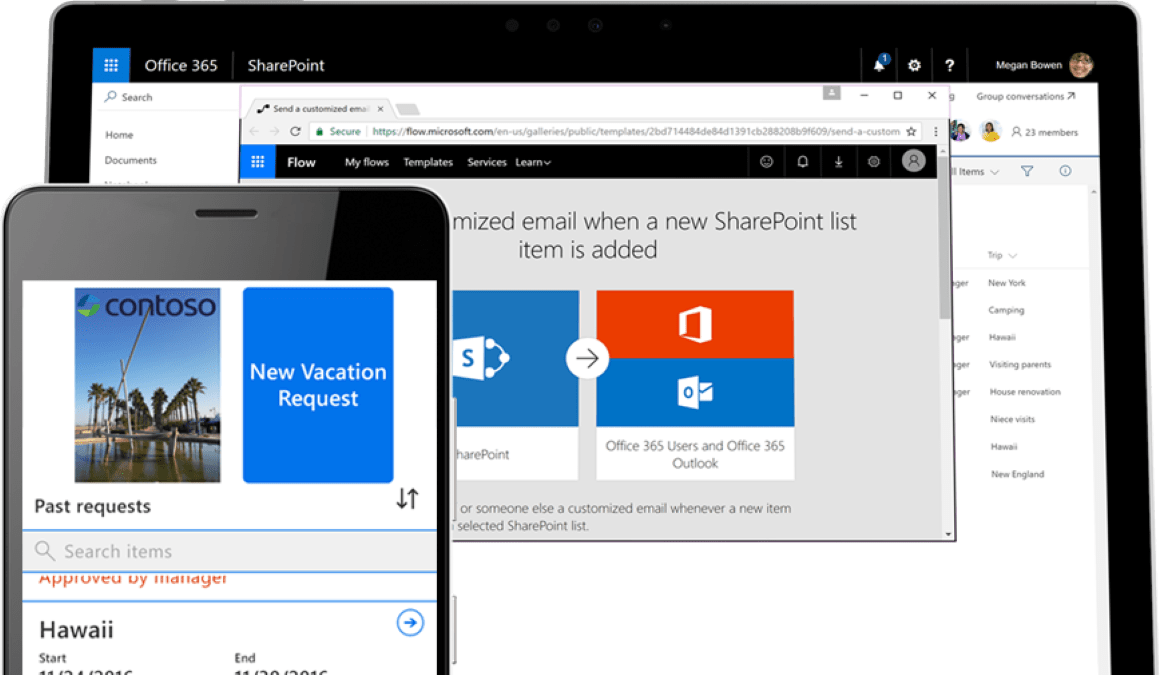
SharePoint Modern gets a facelift with new branding features.
Have you noticed? Modern SharePoint got a facelift with new branding features that you can now customize. There are four new branding features: themes, headers, navigation, and footer. Let’s take a quick tour.
Note: To change and customize your page, you will find the four features under the gear icon in the upper right-hand corner.
- Themes – You can pick from predefined color themes in SharePoint Modern. The color schemes have been designed for better readability. In addition to the predefined color themes, you can add and customize the supplementary color themes to enhance the color contrast based on your preferences.
- Header – You now have the option to change the header and the overall look of your page. For the standard header, you have the logo, site title, and navigation. With the new branding feature, you now have the option to select the compact mode, which uses less vertical space on your page. The compact mode allows users to get to the content faster without having to go through the bulky header as it was in the standard mode. Unfortunately, you can’t adjust or customize the header size at this point. What you can change is the background color of the header with the theme colors.
- Navigation – Instead of navigating through the site with a standard cascading menu that goes vertical and sideways, a mega menu is a new option for navigation. The mega menu expands automatically with all the site links. It gives users a lot more visibility without having to do extra clicks to get to the actual links. It’s remarkable how this tiny switch makes a powerful change for users to navigate. You can also edit the links and the header for your navigation under the “edit menu” where you find all the link controls.
- Footer – In case you don’t already know, the footer is located at the bottom of the page. You can customize the footer with the desired logo, social links, or internal links. You can manage your footer now as you do for the mega menu for the links and headers. With the customized footer, you add an extra layer of content to your page. You can prioritize the content that’s relevant to your audience or what you want to focus on, such as executive blogs for your readers.
There you have it, four new features to take advantage of and play around with. Unlike the old SharePoint with many restrictions on changes, Modern SharePoint gives you more flexibility and options to tailor your organization’s pages to better align with your business objectives and reflect your company’s spirit. Give your SharePoint a facelift and try these new features.
For more information about gaining a competitive advantage with digital transformation, contact Red Level today.
Related Posts
Windows 10 End of Support is Coming Microsoft is officially ...
If you’re reading this, you’re likely the go-to person for ...
Businesses across all sectors are leveraging the powerful capabilities of ...


