Quick and Dirty Reporting for SharePoint 2013 Applications – Part 1
Good restaurants are hard to come by. The combination of tasty food, atmosphere, price, and service is a mix many owners never master. The same is true in using SharePoint as a platform to develop a department sized application. Microsoft Access, Excel and Lotus notes have traditionally played in this “no-code” space. However, SharePoint offers: tables, forms, a workflow engine, but lacks a little in the reporting area. A simple tool I have been using to resolve this shortcoming is Microsoft SQL Server 2012 Report Builder (you can download it for free here). Report Builder is a free graphics interface tool that visualizes data in table or chart formats. Report Builder can connect to numerous data sources, but what I like about it is that a SharePoint list is one of them. One of the core benefits of this tool is that you don’t need professional developer skills or tools to use this tool. With a quick little install, and a little report writing skills (MS Access / Excel) you can improve your SharePoint applications with stunning charts, graphs, and tables.
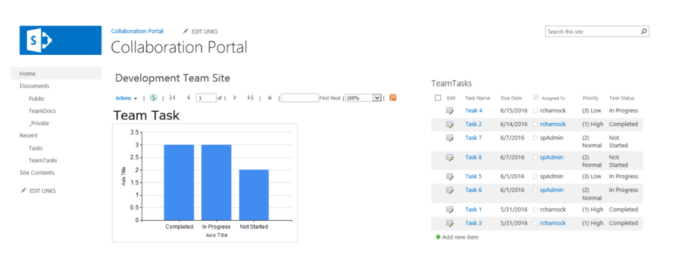
I have broken this down into two parts in this blog I will cover the building of the report. Next week I will go through displaying the report.
Part 1: Build the Report
- Create a default Task List app. (Setting > Add an App > Tasks)
- Download and install Report Builder. This can be done at https://www.microsoft.com/en-us/download/details.aspx?id=29072
- In the installation include a URL to your SharePoint site as the report server. The configuration does not matter for this scenario.
- Open Report builder. If you get a Connection error, ignore it and click OK

- There is a wizard which can be used but I will use the manual method to illustrate more.
- Click the option: Blank Report

- Right Click the folder: Data Sources

- Give the Dataset a meaningful name. I will name mine TasksDS
- Select the option: Use a connection embedded in my Report
- Select the connection type: Microsoft SharePoint List
- Paste the site address into the connection string box
- Click the button: Text Connection
- If you get an error: Check the URL

- Click the side button: Credentials
- Select the option: Use current Windows User
- Click the button: OK
- Note: the TaskDS is now listed.
- Right Click the folder: DataSets, Click the option: New Data Set
- Enter a meaningful name. The dataset is where you select what list from you site you will like to use as the core data for the report.
- I will enter the name: Tasks_Set
- Select the option: Use a dataset embedded in my report
- Select the data source: TaskDS
- Click the button: Query Designer
- Place a check in the list you want to use in your report. I will select the list: TeamTasks
- Click the button: Run Query to get a preview of the data. This is a good check to make sure you have selected the correct list.
- Click the button: OK
- Note: that closes the Query Designer
- Click the button: OK
- Note: The Dataset properties closes.

- Note: The Dataset properties closes.
- Now we can design the report.
- Click on the text “Click to add title” and add a title. I will add the title: Team Tasks
- Click on the Insert menu tab
- Click the ribbon button: Chart wizard
- Select the Listed Dataset
- Click the button: Next
- Select the chart type. I will select Column
- Click the button: Next
- On the next screen you design the layout of your chart. You drag the field you need to the different location. I will drag the following:
- Categories: Task_Status
- Values: Count(ID)
- Note: it will default to sum. Click the drop down arrow to change the function.
- Click the button: Next
- Select a style. I am going to choose: Generic
- Click the button: Finish
- Note: the wizard closes and your new chart is added.
- Next size the chart and report to be snug to each other and fitting your desires.
- Note: you can remove chart elements that you do not need by selected and pressing delete.
- Note in the image below, I removed the legend, Chart Title and execution time.
- Click the button: Run
- This will execute the report and show you what the final product will look like.
- To make changes click the button: Design.
- Note: that takes you back to the design surface where you can alter the report more.
- Once you have finished tweaking the report/chart to the way you like, click the Save button
- Save the report to your local machine. Remember to chose a meaningful name
- I will put mine in the Documents folder with the name: TeamTask_Status_Chart.rdl
- Close Report builder
Now your report is ready to go. In my next post I will dive into how you can visualize these reports in SharePoint.
Reference:
To learn more about how use Report build builder more Microsoft has a great help and walk through at: Report Builder in SQL Server 2016
To learn how to configure your SharePoint 2013 Farm to enable the use of Report Builder reports, complete steps 1-3 in the following article: Install The First Report Server in SharePoint Mode
For more information about gaining a competitive advantage with digital transformation, contact Red Level today.
Related Posts
At this year's Modern Workplace Summit business leaders discussed real-life ...
I have been involved in the technology industry, in the ...
Sometimes technology makes some scenarios worse. At our last Nintex ...


